
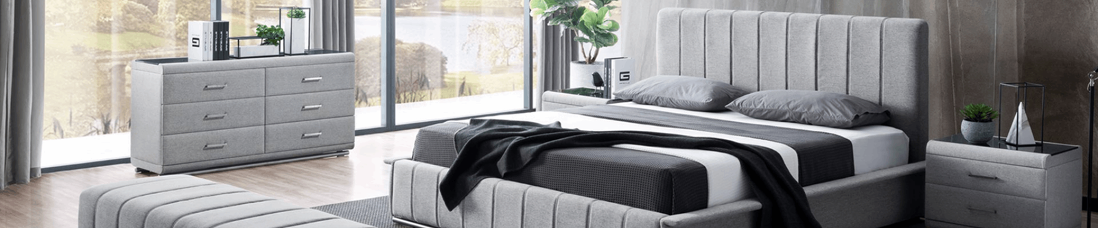
Introduction
In contemporary interior design, an ottoman is no longer just a footrest; it’s a statement piece that can define the mood of a room. When you opt for a multicolor ottoman, you instantly introduce energy, texture, and a splash of personality that ties disparate décor elements together. For furniture buyers who crave both style and practicality, understanding the advantages, choosing the right material, and mastering placement are essential steps toward a cohesive look.
1. Why Choose a Multicolor Ottoman?
Boosts Visual Interest
Color is the fastest way to catch the eye. A multicolor ottoman can act as a focal point, drawing attention without overwhelming the space. Whether you select a subtle gradient or a bold kaleidoscope pattern, the piece instantly creates depth and movement.
Enhances Flexibility
Because it blends several hues, a multicolor ottoman works with a wider range of colour schemes. It can harmonize a neutral sofa while adding a pop of colour that complements accent pillows, artwork, or rug patterns.
Provides Dual Functionality
Most modern ottomans come with hidden storage, a sturdy top for coffee or board games, and a comfortable seat for guests. The multicolor finish doesn’t compromise these practical features; instead, it brings a fresh aesthetic to everyday utility.
2. Key Factors to Consider Before Buying
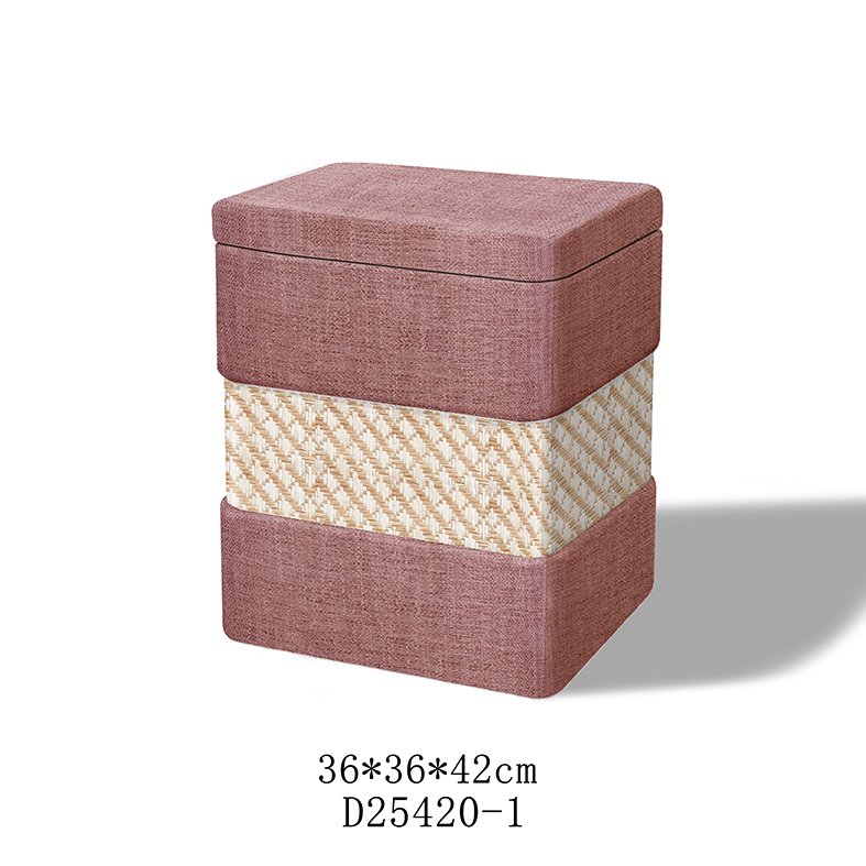
Material Matters
- Fabric upholstery – Ideal for plush comfort and a wide colour palette. Look for stain‑resistant blends if you have children or pets.
- Leather or faux‑leather – Offers a sleek, upscale look. Multicolor leather is often achieved through dye‑weaving techniques that maintain durability.
- Velvet – Provides a luxurious feel and deep colour saturation, perfect for low‑light rooms.
Size and Scale
Measure the intended area carefully. A 24‑inch ottoman works well beside a loveseat, while a larger 36‑inch or 48‑inch model can serve as a coffee table replacement in spacious living rooms.
Storage Options
Decide if hidden compartments are a priority. Some designs feature removable lids, while others incorporate zippered interiors for easy access.
Colour Harmony
Use the 60‑30‑10 rule: let 60% of the room stay neutral, 30% adopt a secondary colour, and 10% showcase the accent – your multicolor ottoman. Pull one or two of the ottoman’s hues to use in throw pillows, artwork, or wall art, ensuring a balanced palette.
3. Styling Tips to Make Your Multicolor Ottoman Shine
Layer with Textures
Combine the ottoman with a woven rug, a chunky knit blanket, or a sleek metal coffee table. Contrasting textures prevent the vivid colours from feeling chaotic.
Build a Cohesive Seating Arrangement
Place the ottoman within a conversational layout: a sofa, two armchairs, and the ottoman form a semi‑circle that encourages dialogue. Ensure the ottoman’s height aligns with the seating for ergonomic comfort.
Use as a Statement Standalone Piece
In minimalist spaces, let the ottoman stand alone on a simple rug. Its bold colours will become the room’s centerpiece, especially when paired with a neutral wall hue.
Incorporate Matching Accents
- Choose throw pillows that echo one or two of the ottoman’s colours.
- Hang artwork that features similar pigment families.
- Swap out a single curtain panel in a coordinating shade for a subtle, elevated effect.
Seasonal Swaps
A multicolor ottoman adapts easily to seasonal décor changes. Swap soft pastels for winter’s deep jewel tones, or replace bright summer hues with warm autumnal shades, all without replacing the core furniture.
Conclusion
Choosing a multicolor ottoman is an investment in both visual drama and functional versatility. By carefully assessing material, size, and storage needs, and by applying thoughtful styling techniques, you can transform an ordinary living area into a vibrant, inviting haven. Whether you’re redecorating a modern loft or refreshing a family den, let the multicolor ottoman lead the conversation—comfortably, stylishly, and confidently.